
Branding Identity
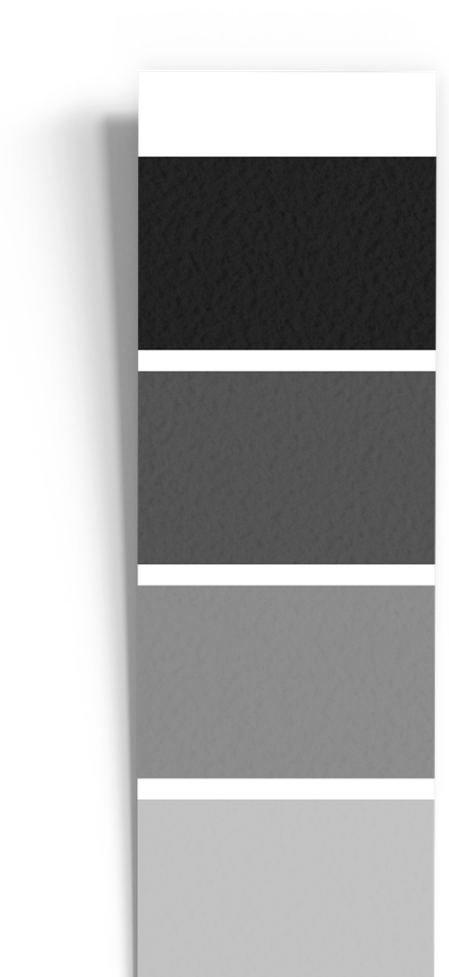
The REALNYX® brand identity stands for minimalism, clarity and timeless elegance. Its visual language is built on a pure black and white core, expressing strength, trust and refined sophistication across every platform.
Colour palette & logo variations
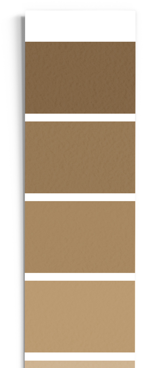
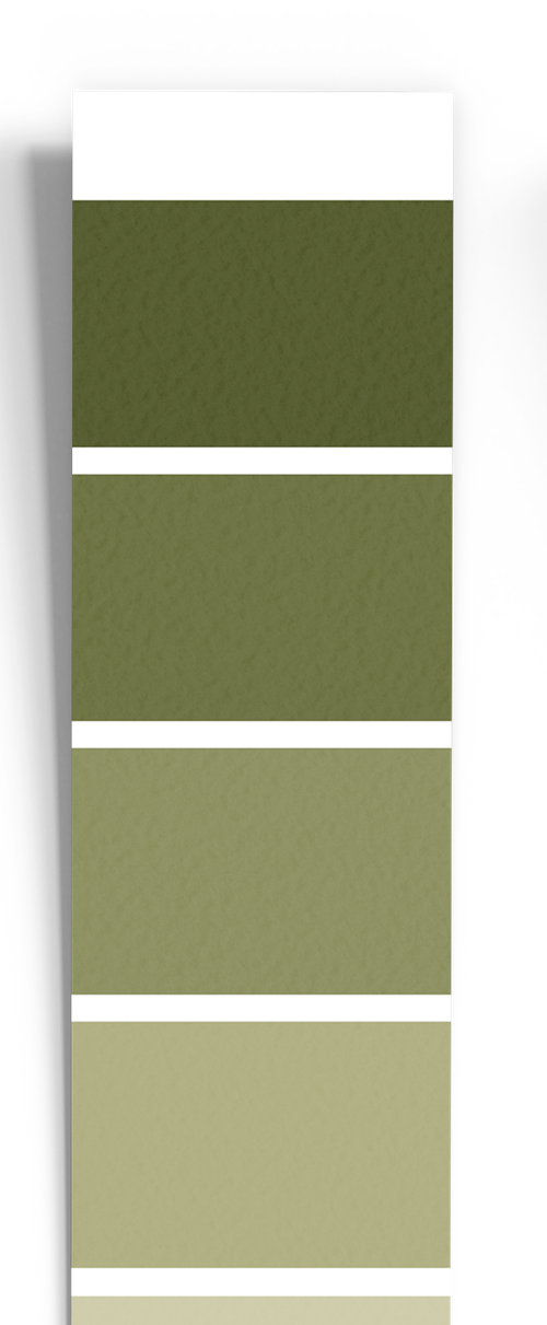
To enrich the monochrome foundation, REALNYX introduces curated accent palettes of soft beige, sand hues and natural sand-green tones — applied with restraint to preserve a clean and premium balance.

The REALNYX® mark is available in three ready-to-use forms — horizontal, stacked and icon-only — each in positive and reverse versions.














Type style
REALNYX uses Inter and Manrope. Classic, regular weights form the foundation of our typography and keep communication clean, calm and highly legible. Bolder weights may be used selectively for emphasis, while the classic style should always remain dominant.
Primary typeface for clear text, navigation and digital interfaces.
Complementary typeface for distinctive headlines and selected brand messages.
Brand applications
REALNYX's visual identity comes to life across physical and digital environments — from the office floor to the street, from the desk to the screen.
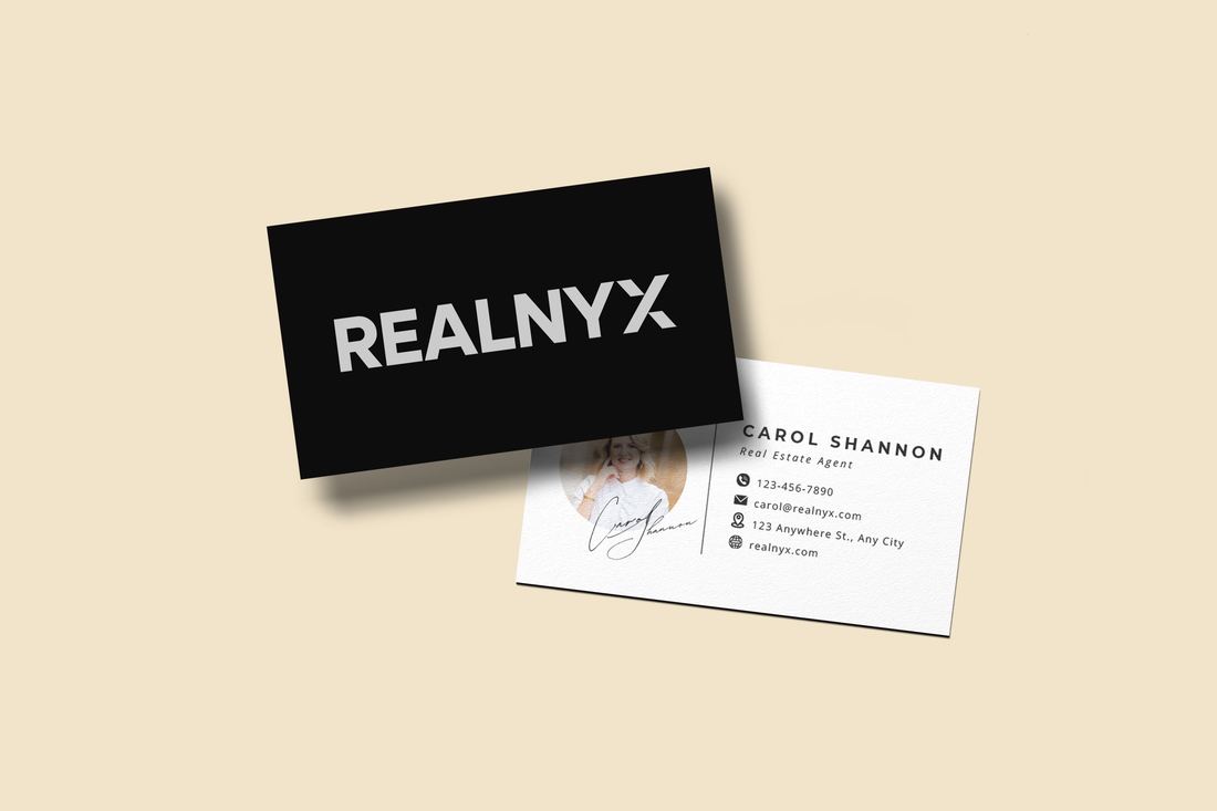
Business Cards & Stationery
Minimalist black-and-white design with beige accents, carried consistently across cards, letterheads and internal print.
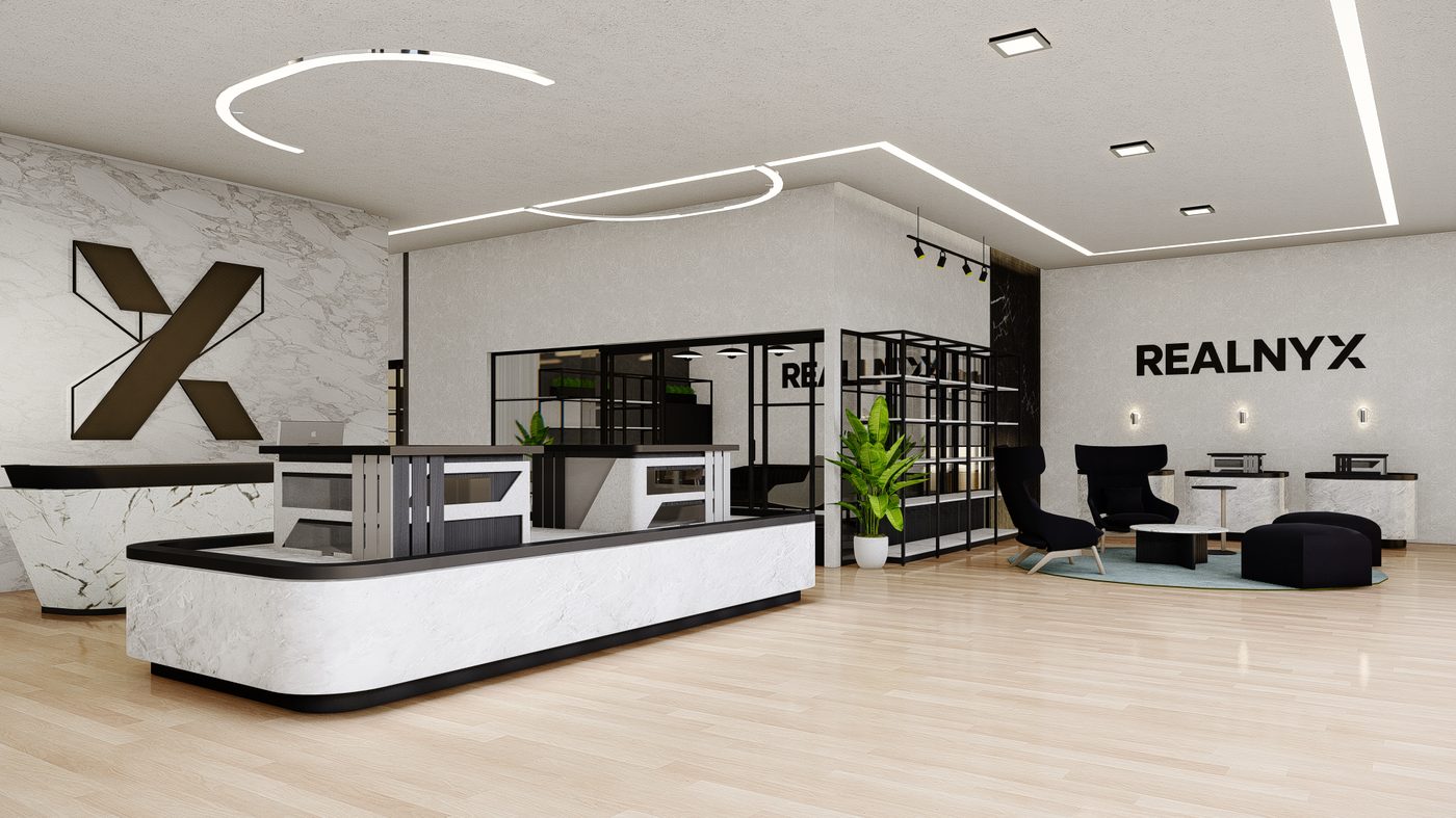
Office Signage
Strong monochrome branding built for a bold, modern presence in every branch and franchise location.
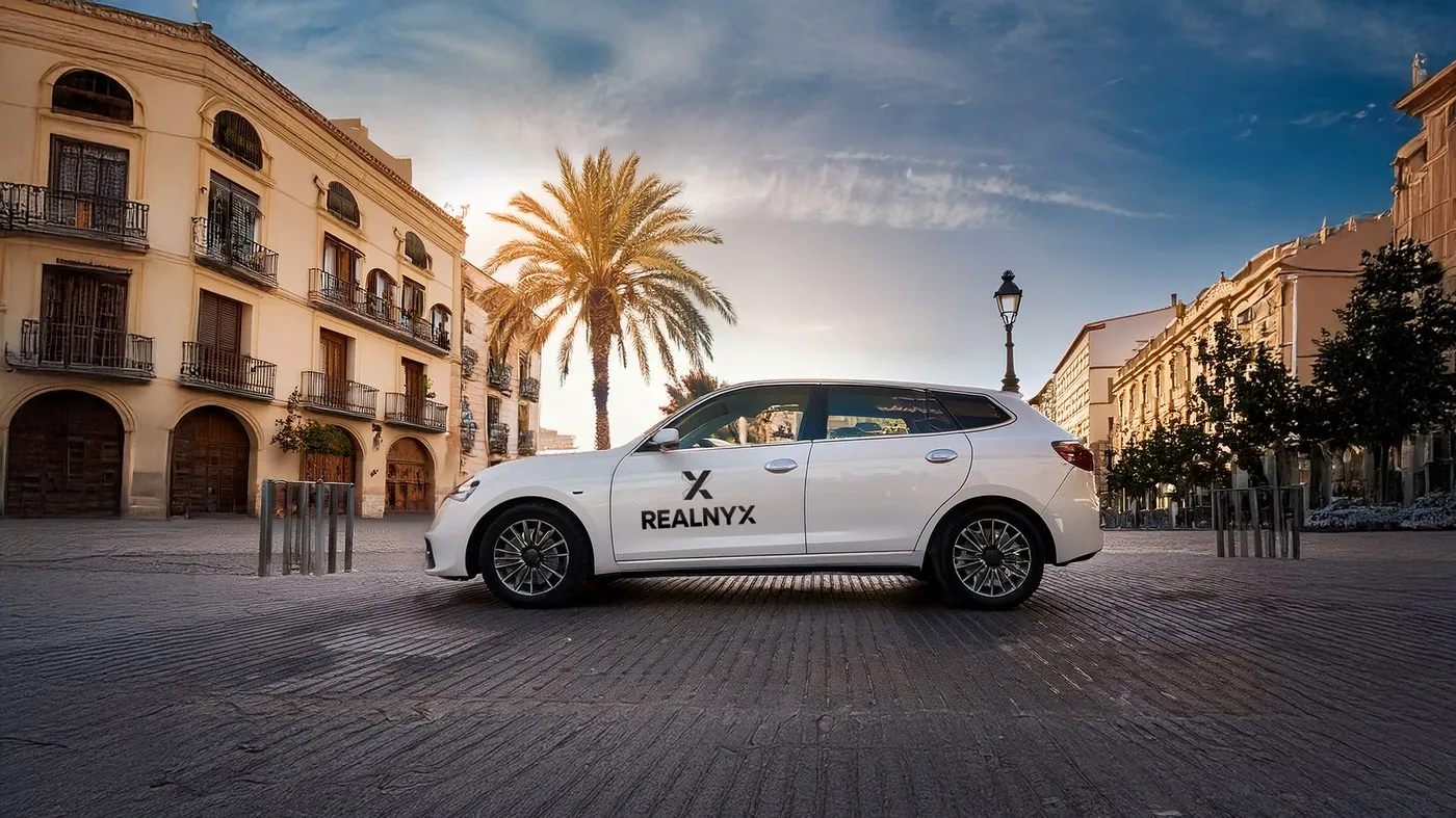
Vehicle Branding
Elegant, high-contrast black and white applications designed for maximum visibility on the road.
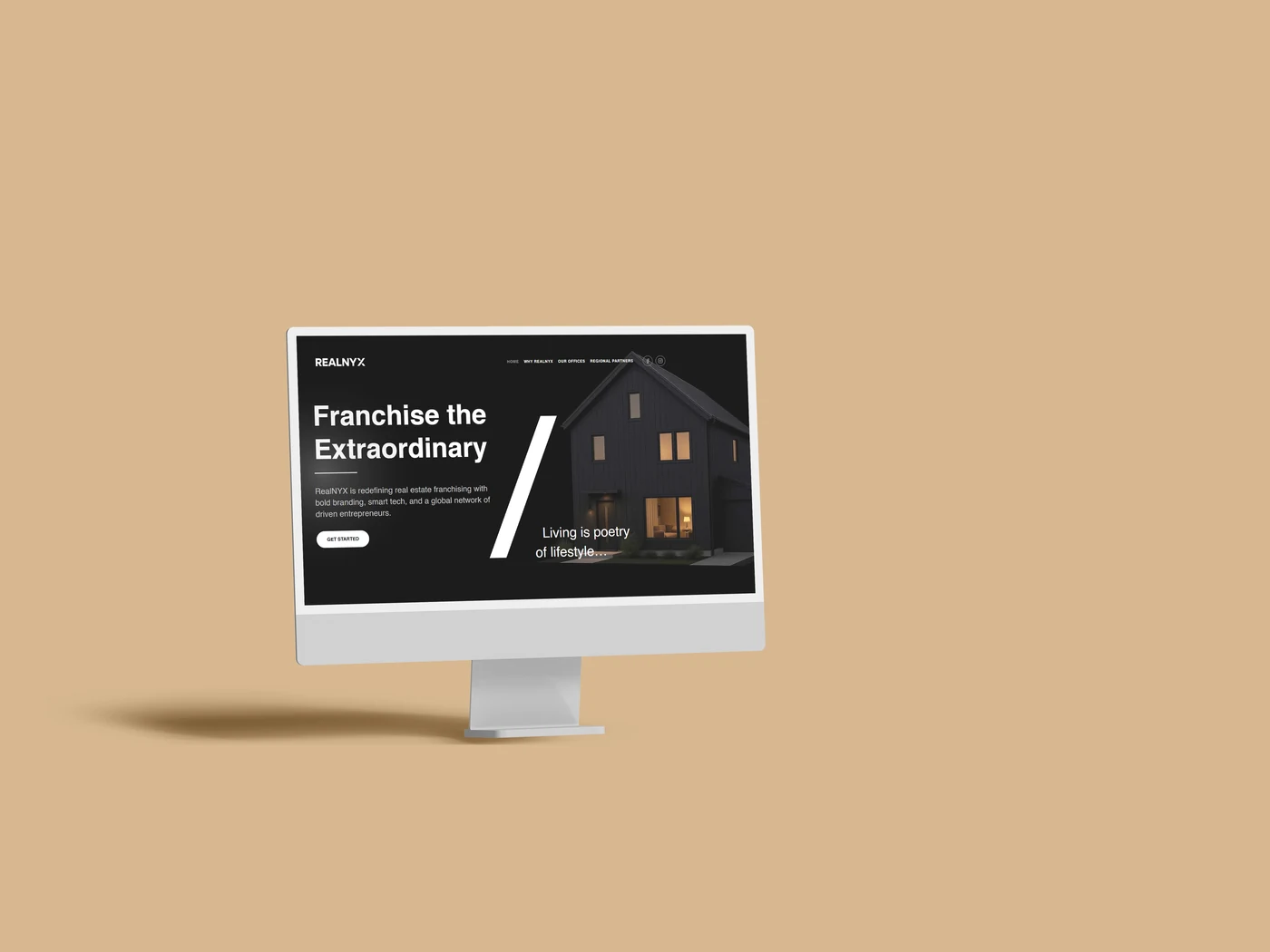
Website & Social Media
Consistent minimal design across platforms, including social media grids and professional web layouts.
One mark. One rule at a time. Every application of the REALNYX identity is built to be unmistakably ours — minimal, precise and quietly confident.